Friday, 21 December 2012
Production Log: Friday 21st December 2012
I finished my draft music magazine today. During the week I changed my masthead as I was told that my selected font looked more like rock and not pop.
Before Now


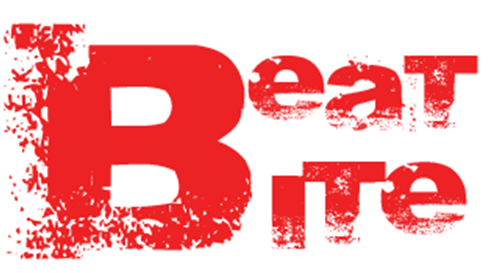
As the above images show my masthead before I made the change and after. I now feel more confident with my magazine. As I had only started creating my magazine a week ago with all my resources such as fonts and images I feel I have created a good draft under pressure of the deadline. I am aware of all improvements that are needed to be done as well as other features that need to be added like the page numbers on each page . Also the first page of the article page I am not happy with at all as there is too much white space.
Before Now

As the above images show my masthead before I made the change and after. I now feel more confident with my magazine. As I had only started creating my magazine a week ago with all my resources such as fonts and images I feel I have created a good draft under pressure of the deadline. I am aware of all improvements that are needed to be done as well as other features that need to be added like the page numbers on each page . Also the first page of the article page I am not happy with at all as there is too much white space.
Monday, 17 December 2012
Production Log: Monday 17th December 2012
Over the weekend I found all the fonts I needed. I also finished my article page. However when I got feedback I was told that I needed more images and pull quotes as I had forgotten them. I also finished my poster page. I didnt have to make any changes in that. As I had to add another image on the article page, I was going through my photoshoot images to see what other suitable image I could use. I didn't want one of my model standing as I already had quite a few of those. So I found one of her sitting on the soundbox and it would look perfect in the corner. So I started editing the image on photoshop.
 |
| The fonts I found to use in my magazine |
Friday, 14 December 2012
Production Log: Friday 14th December 2012
I continued with my magazine. I decided that I didn't like any of the fonts in the programme so I wasn't feeling that the magazine was going well. I found out some good websites which allowed downloading fonts. I started researching further into the fonts and what ones I will be using for the masthead, article, pull quotes, poster and contents page. As the article had to be in a clear, legible font I decided to have a font like the typewriter style. For the masthead I wanted a big thick font and that looks like its been biten into. I also researched what I should have on my poster other than the image itself.
 |
| The font I will be using |
Monday, 10 December 2012
Production Log: Monday 10th December 2012
Today I continued designing my magazine on Adobe InDesign. I looked at the magazines previously created by other people and it gave me a better idea of what else I should include in my magazine, especially my contents page. As per my sketches I realised that I had to include much more content than just the features and reviews. I could to include a band index and I also had to include the editor's note on the contents page. I decided to import in my article and images so I can do the layout properly.
 |
| A band index |
Saturday, 8 December 2012
Process: How to change colour
This is how I changed colour of my model's trouser from brown to red on Photoshop.
Tuesday, 4 December 2012
Chosen Images
Chosen Images
This PowerPoint shows the images I have chosen for each page of my magazine. I feel they are the best ones and are suitable for my magazine.
Feedback
The images are bright and bold and catches my attention which makes me find out more about them. The costumes are also colourful so they suit the magazine theme.
Monday, 3 December 2012
Production Log: Monday 3rd December 2012

Transcript
As I had a good idea for what I want my magazine to look like, I started it on Adobe InDesign. This is the programme/software I will be using to create my whole magazine. I started to layout my magazine and get to know the tools and how they work. I didn't exactly start my magazine as I hadn't even decided on my masthead and how it will look. The masthead ideas I did before were for a different name and I didn't like it. So for the rest of the time I was just exploring the programme and thinking of ideas for what my masthead can look like.
Subscribe to:
Posts (Atom)