Looking back at your preliminary task, what do you feel you have learnt in the progression from it to the full product?
This question is where I have explained the progress I have made in terms of skills from the first task which was creating the school magazine to the final task which was creating the music magazine. I talked about research, planning, photos and skills on Photoshop and InDesign I have learnt.
Friday 8 March 2013
Question 6
What have you learnt about technologies from the process of constructing the product?
This evaluation question allowed me to discuss how I've used professional equipment and software to create my magazine. I talked about camera, lighting, Photoshop and InDesign. I explained a range of techniques I used in the production and mentioned specific features of Photoshop and InDesign that I used. I also highlighted the benefits of technology I had in the process.
Transcript:
During the process of the construction of my music magazine, I have learnt a lot about the different technologies within media such as the cameras and photo-shoot equipment, the different programmes that I used to create to a professional looking magazine and the different tools within the programme.
Photoshop Equipment
One of the first and main equipment I used for my photo-shoot was the camera. I used the proper big professional camera which had a lot of different settings allowing me to create different angles and take different types of camera shots. I achieved different types on angles by standing on a chair to create a high angle shot and got the models to stand on chairs or tables to create a low angle shot. I rarely ever took photos landscape as portrait was better for magazines. I only took photos landscape when my models were lying down taking the photo portrait did not allow me take their full shot. When I was doing the time-lapse I had a camera on a tripod at the back of the room.
The key element in creating a successful image was the lighting. Every different environment needs different lighting. The lighting creates a mood for the picture. For example if the lighting is dark and dull the mood will also portray a dull mood. I used high key lighting as this lighting created the right mood for my magazine genre of pop music and the colours red, black and white. To create the right mood and lighting I used professional white umbrellas.
Another piece of equipment is the white backdrop and the white flooring. In this space the model stood and posed for the photos. This equipment allowed me to edit the photos easily but just removing the white. For me to make it easier I just had to make sure that my models did not wear white. However I did end up having one of my models wearing a white top but it just took a little longer to edit.
Adobe Photoshop
Adobe Photoshop is the programme I used to edit my images. I used a number of tools to get my images to the way I wanted them.
The main tool I used was the colour range tool which removed the white background and anything else which I didn't want in the final image. For example in one of the images I didn't want the wire from the mic as it didn't look right so I got rid of that using the Quick Mask Mode tool.
Another tool I used was the adjustment tool. This tool gave me a lot of options in order to improve image colour or brightness. I used this tool to change the colour of one of my model's trouser from brown to red to match my colour scheme for the magazine. Another way I used the adjustment tool was when I brightened the main image on the front cover because it was a close up so it looked too dark. I also used the hue/saturation option to make the signatures of each model a darker black.
Furthermore, a tool which was really effective in images was the refine edge tool. This allowed me to feather the edge and smooths it so my editing didn't show at all or as much especially when it wasn't too neat.
Another tool I used quite effectively when creating the album cover is the FX tool. This tool adds extra features to objects such as shapes and text. I used the bevel and emboss tool the most for the text and I used the drop shadow tool for objects.
Adobe InDesign
Adobe InDesign is the programme I used to create my whole magazine. This programme introduced me to a lot of new tools that improved my initial magazine ideas and convenience within the process of my magazine.
One of the first things I found useful and convenient is the Swatches. This made it easier to select the colours that I wanted to use throughout my magazine. For example I wanted to use a particular shade of red so I added it to my Swatches to have an easier access to the colour rather than trying to find it in the colour picker.
Another thing that I learnt in Adobe InDesign is how to text wrap. This tool I found quite hard to use for some reason but I slowly got it. The text wrap came in handy when creating pull quotes and fitting an image by the text on the double page spreads.
Another tool is the FX Tool. This tool is also in Adobe Photoshop but as Adobe InDesign is the programme I used the most so there for I used the FX Tool a lot more in Adobe InDesign. In the FX Tool I used bevel and emboss throughout my magazine. I used the bevel and emboss effect as it made text and shapes look really effective.
Another thing that helped me was the guidelines on the page. This helped me the most when I was doing putting my article in columns. It allowed me to split the columns equally across the page. It also helped me to layout all the objects on the page.
Blogger
Blogger is the site I use to publish all my work I do which is to do with the coursework. I used it to do write what I do each week. Also I found it easier as I could access it anywhere and any time which allowed me to do more work on my planning and research.
Blogger also allowed me to look at previous media coursework blogs from other people as inspiration and guideline for what I need to do to for my coursework. Looking at other blogs allowed me to do better and expand my skills more.
Question 5
How did you attract/address your audience?
In this question I have explained what my magazine contains to ensure it will sell, how I have made it attractive and other selling techniques e.g. use of new media.
Transcript
My magazine’s target audience is attracted firstly through the colours I have used which are red, black, grey and white. These colours suit males and females allowing it to reach a larger audience. Additionally these colours go well with my magazine theme of pop and appeal to my target age of teenagers and above. The colours look appropriate to my target audience of pop magazine compared to some that include gender bias colours such as pink and yellow.
Furthermore, I have included a lot of different conventions a magazine that would attract my audience both ways; make them want to buy my magazine and give more for the price they pay. To get them to buy the magazine I included what they want. I did this with the research I carried out. One of the researches was looking at existing magazines and how they achieve their target audience. Secondly I carried out a survey for teenagers as that is my target audience which involved questions which would help me decide what they want; for example, price of magazine, genre of magazine, what kind of freebie they would like – CD, poster, etc. I have also included competitions to win tickets to big music events so that covers the point that my audience are getting more than the price they pay for.
The audience that I have targeted is quite young so they will be involved in the new technology meaning social media such as Twitter and Facebook. The use of social networking sites will allow my audience an easier access to sneak peeks of my magazine each month which will encourage them to buy the magazine to know the full stories and gossip. Additionally the young audience will have good phones which are Smartphones such as Android, Blackberry and iPhones which have multiple uses such as emails and apps. This will allow my magazine to email newsletters to those who have subscribed to my magazine. Also phones such as iPhones will be able to download the App for free from the App Store and the App would include the front covers of all issues so far and it would be possible to buy the latest issue of the magazine from the App itself however it will be at a higher price.
Additionally, my articles are based on gossip as that is what I have found from my survey results. My audience mostly care about the personal life of an artist which is what I have aimed for. My article includes an interview which reveals hidden features and characteristics of my model. This also links with my images that I have used because my article is about a hideous looking girl who then looks pretty and the audience can relate to this as it can change ones perspective.
The style of writing of my magazine is easy to read and my audience would feel calm and relaxed whilst reading it. I have found out that different magazines have a font which is suitable for the genre of the magazine. For example a metal rock genre have big bold looking font which expresses the metal rock type of music. So I feel the 2 main fonts I have used throughout suits my theme of pop music.
Question 4
Who would be the audience for your media product? - Video with Voiceover
This question was about my target audience and what their gender, age, social class and social habits. I also mentioned why it would be that particular audience and how it fits in with my media product.
Transcript:
The target audience that I have chosen for my music magazine is teenagers to young adults aged from 16 to 25 years old but the older adults are also free to read. I have chosen this age range because music artists are usually this age as well and the audience of the similar age to them usually idolise them. The age 16 is typically known as the age where one is becoming a young adult who earn money but doing part-time jobs so they can go out themselves and buy magazines. Also at this age people are mature and old enough to travel on their own to go to concerts and other music events. So my magazine would allow my audience to find out what music events are held when and where.
I feel my magazine will appeal to both genders equally. My magazine is mutual with both genders as it includes content that will make the male audience read my magazine and the female audience. The male audience would read my magazine as the genre of music my magazine is based on pop and this genre tends to be popular in male as most of the pop music artists are female and the male gender feels more attracted to the female artists. The female audience would read my magazine, due to the similar reason of pop artists are mainly female and the female audience would look up to them and idolise them. Additionally the colours that I have used for my magazine are gender friendly so it will attract to both genders.
I feel my magazine will appeal to both genders equally. My magazine is mutual with both genders as it includes content that will make the male audience read my magazine and the female audience. The male audience would read my magazine as the genre of music my magazine is based on pop and this genre tends to be popular in male as most of the pop music artists are female and the male gender feels more attracted to the female artists. The female audience would read my magazine, due to the similar reason of pop artists are mainly female and the female audience would look up to them and idolise them. Additionally the colours that I have used for my magazine are gender friendly so it will attract to both genders.
The social class that I have chosen for my magazine is A-C1. I have chosen these social classes because I think that these are the classes that will be able to afford to buy my magazine on a monthly basis. Although I am targeting my magazine at younger people as well, it is more likely to appeal to young people with parents within these social classes. As my magazine is priced at £3.50 per issue, it is likely that only people from these social classes would be able to afford every issue, however as the subscription deals on offer allow both regular and irregular readers to save money, members of other social classes will also be able to access the issues they want and when they want at a cheaper price.
The readers of my magazine will share similar social habits and interests. My magazine meets the audience’s expectations and extra features which they would be interested in. For example, my audience would like to see opportunities to win tickets by taking part in fun competitions so I have included quite a few competitions where readers can take part in and have a chance of winning tickets to music events such as the Jingle Bell Ball and the X Factor Tour 2013. This will increase popularity within the age range and the audience will get more than they pay for.
Question 3
What kind of institution might distribute your media product and why? - Video with Music
This question is about which company would distribute my magazine. It is likely to be one of the four that form the oligopoly (IPC, etc). Also I have gone with a company that doesn't already have a magazine similar to mine. I explained why the company would like my magazine and how they might or could distribute it.
Transcript:
Hearst Magazines UK is the largest digital publisher in the UK. Their reach extends to 1 in 3 UK women and 1 in 4 UK adults. Hearst Magazines UK is the largest digital publisher in the UK. Hearst Magazines UK publishes 20 consumer titles in the UK: All About Soap, Best, Company, Cosmopolitan, Country Living, ELLE, ELLE Decoration, Esquire, Good Housekeeping, Harper’s Bazaar, House Beautiful, Inside Soap, Prima, Red, Real People and more.I think Hearst Magazines UK is a suitable distributor for my magazine as competition will be low, extremely low. This is because Hearst Magazines UK currently do not distribute any music magazines as the list of the magazines mentioned are majoritily to do with women and their lifestyle. Also, my magazine is targeted at women and men so Hearst Magazines UK will expand their gender to both, males and females as at the moment Hearst Magazines UK only distribute women magazines. There are a number of ways Hearst Magazine could distribute my magazine. They could put in adverts in their current magazines to get their existing customers to know about my magazine.They could also create a Facebook and Twitter accounts as the target age are more into the social media.Creating Facebook and Twitter accounts will allow existing and potential customers to engage with my magazine. Hearst Magazine could give out leaflets through the post or in book stores or in the newsagents to spread the word.
Question 2
How does your media product represent particular social groups?
My
magazine represents particular social groups by its cheerful look and tone.
From my front cover you can see that the colours I have used such as red,
black, white and grey which portrays my target readers as joyful and outgoing
and the black and grey colour indicates a sophisticated look representing my
potential readers to be similar to that. This is also seen from the font type I
have used. My font illustrates a calm relaxed mood meaning my readers tend to
follow that path. The font isn't big and bold like a hard rock magazine as that
indicates pain as the font for rock magazines is broken so every font and genre
has a connotation. This cheerful, jolly tone is not only due to the type of
text I have used but it is also due to the images and types of camera shots and
angles I have used.

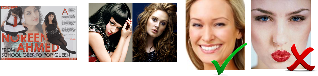
I have used photos that portray a pop style look of
being stylish and elegant like pop music artists such as Katy Perry and Adele
as my social group are similar but at the same time would tend to be unique and
not follow the popular trends as much. These types of pop artists are generally
looked up to and are idolised. Also the costumes my models have worn are
commonly seen on pop artists whom link in well with my chosen genre of pop. My
reasons for choosing my two models are that they represent the age group
firstly. They are both in their teens and they dress to the latest fashion
trends and their own fashion trying to get new fashion in their fans. Another effective
way my models represent social groups is the body language and facial
expressions. They are both always smiling and not pouting as that tends to give
an image of one showing off.
Additionally my models have portrayed themselves as
to be approachable due to the way they talk and the facial expressions in their
photos in the article suggest a more open person than the front cover picture.

The
types of shots I have used are varied throughout as it had to suit my article
as well. My main image had to be portrayed as a brave young girl so I used a
close-up shot. I used a close-up shot also because when doing my research and
analysing front covers I realised that most pop music magazine front covers are
close-ups of the artist with their hair blown out giving a carefree look which
promotes the genre and increases the relationship between readers and the pop
genre. I have used similar types of poses with those in pop music magazines so
I know it is suitable and fits my magazine theme.

Additionally, the effects such as emboss gave my
magazine a really professional look which made it more appealing and attractive
to readers as it didn’t look normal plain text. The emboss effect gave it a 3D
effect and this ended up being my magazine’s key effect throughout. Also
brightening up my images, especially the front cover main image made my
magazine look more engaging to the readers as my model is looking right into
the camera which makes it seem as if she is looking right at the reader. This also
increases the cheerful tone.

I expect readers of my magazine to be strong fans of
my chosen music genre and not just the artists and their gossip which is why I
have included a free A4 poster of a different artist each month. This
represents readers of my magazine as being loyal and devoted fans of the pop
genre.

-----------------------------------------------------------------------------------------------------------------------
This question explains that my magazine is representing a certain social group - i.e. fans of certain types of music and I have identified how my particular musicians are represented. To portray this I have discussed mise-en-scene so the costumes, body language, facial expressions, as well as the tone of the article. Also for pop artists I have have discussed how I have represented them as approachable, fun, innocent, etc.
Question 1
In what ways does your media product use, develop or challenge forms and conventions of real media products?
This question asked me to analyse my magazine. I have discussed how my magazine is typical or unconventional of my genre of music magazine. I have commented on each page and I have identified all the conventions of magazines and how they apple to my magazine.
Transcript
During the creation of my music magazine, I continuously looked at existing magazines of my music genre which is pop music and how the conventions are portrayed and presented. I tended to look at the Billboard magazine as the layout and conventions really inspired me and it included my kind of ideas and suited my target audience especially after the audience survey. I feel I have successfully used the conventions of an existing magazine.
Front cover:
The masthead of my magazine appears at the top right hand
corner of my front cover because this is where majority of the mastheads appear
of music magazines and also most viewers’ eyes are directed to the masthead as
soon as they have seen the main image and main sell line. The audience would
look at the main image as that it is generally most important however in the
case of my magazine I have used an extreme close-up with my model looking right
into the camera so it seems she is looking directly at the readers which
engages them with the magazine. Due to the use of an extreme close-up the
readers will immediately look at it and then look at the name and masthead to
see who the story is done by, which magazine. The masthead appearance and
colour was inspired from the NME magazine even though it is an indie/rock genre
magazine whereas mine is pop genre I didn’t feel there is anything immoral in
using the appearance. My masthead does not appear to look like NME’s masthead
but the idea of putting it in red and in top right hand corner was used.
I have used a tag line to promote my magazine as to be the
best as the tag line I have used is ‘bite into the best’. It links in well with
my masthead name which is ‘Beat Bite’. I feel the tag line will grasp the
audience’s attention as they want the best. I have incorporated this convention
in my magazine as it looks and sounds effectual on the Q magazine ‘The UK’s
biggest music magazine’. This makes their magazine sound extremely successful
and the best so that is what I was aiming for.
Furthermore, the sell lines are surrounding the main image.
I feel surrounding the main image with text is not crowded as all the text is
away from the text. This was effectively prepared as I had planned the main
image before my photo-shoot so I knew exactly how I wanted it to turn out. I wanted
my model’s hair to blown out with a fan so her hair spreads and fills up the
majority of the page. Additionally, this fitted my colour scheme well and
allowed me to use the colour white more effectively on the black coloured hair.
The sell lines itself are bold looking which attracts the
audience further and makes them read the entire magazine and in order to do
that they would have to buy the magazine so the sell lines have to be
exceptionally superior and must try to grab every potential reader. I have made
the artists names big and bold so the fans can catch the attention of it
easily. I made the main sell line the biggest and boldest firstly because she
is new to the music industry and her name needs to be heard in public.
I have included a barcode which has the price and the
website on it. I have included two prices; one is the UK price in pounds (£)
and the other is a price for EU countries which is in Euros (€). This is commonly seen on
most magazines which suggest that the magazines are not only sold in UK but are
sold in other countries which expands their audience and makes their magazine
more and more popular. This code of magazine is successful and I have included
it to get a high number of people to read my magazine.
Moreover,
I have included a puff by incorporating a free A4 poster to attract my readers
into buying my magazine. I have made the ‘free’ sign big and bold compared to
the other text in the puff.
Contents page
My contents page contains a lot of the conventions you would
see in a regular but thriving contents page starting from the categories the
information is split into which is ‘News’, ‘Features’ and ‘Regulars’. These
three columns are the ones that stand out the most as they are the ones that
need to get the audience attracted as this makes it easier for them to see what
my magazine contains. Another two columns which is bold is the ‘Subscribe’ box
and the ‘Stay in Touch’ column. These two columns have been made bolder so it
can catch the attention of the readers to subscribe and stay in touch with the
new media such as Facebook and Twitter.
Another typical convention found in magazines is a ‘Band
Index’ which is a list of artists and bands that is mentioned in the magazine
with page numbers. This allows fans to find their favourite artist’s page in
the magazine easily. This is normally placed on the left hand side of a
contents page in a different colour.
Furthermore, having quadrilateral images with page numbers
on it is highly conventional in magazines. However I have included an
unconventional feature. This is the fact that I haven’t used any quadrilateral
images with page numbers but images of my models without a box around it. I
haven’t seen this on many contents pages maybe one or two. I feel this makes it
effective as the page doesn’t look too boring with boxes everywhere. However I
have included two quadrilateral images however one is promoting an artist’s new
album and the other is a regular feature that I have included in my magazine
which is ‘Guess Who’ where audience have to guess who the picture is of and
they find out in the next issue of the magazine. This is unconventional as well
but a valuable way of getting the potential readers to become existing readers.
I have also included an editor’s note which is also conventional
in magazines as this tells readers who created the magazine. The editor’s note
contains a short message from the editor stating what is included in this
issue.
The main thing is that I have created the contents page on a
double page spreads which allows me to add more information and have it spread
out.
Double Page Spreads
My first double page spread is conventional as it follows
most double page spreads in existing magazines. The first double page spread
includes an image or more of the artist that the article is based on. My first
double page spread includes a big title which is the artists name and then in a
bit smaller size the title of the actual article. I have included three images
of the artist. This isn’t conventional as not many double page spreads contains
more than one image. Additionally, I have placed the first paragraph on that
double page spread as well. This allows the readers to have a heads-up on what
the article is about. My second double page spread is the main article. I had
presented this in columns which is extremely conventional as mostly all
articles are put in columns. This makes it quite easy for the reader to read. I
have incorporated another image on the left. On the right hand side, I have
added a column which is dedicated to promote the artist’s latest album. This is
seen quite often in magazines whether it is about the same artists or another.
My third double page spread is of another artist. This is also conventional as
I got the idea from an existing double page spread. I have created a montage of
my model doing different poses but in full shots. I changed all of them into
black and white except the middle one and it looked phenomenal. This took up at
least three quarters of the page which allowed me to do a small article
underneath. I have also included pull quotes in both double page spreads which
is seen in all magazines and not only musical ones.
Over I feel I have included all the codes and conventions of
a successful magazine I could that would suit the genre I have chosen and the
target audience. Other conventions are changed to fit in with my target
audience’s expectations.
Comparisons between my final magazine and my draft magazine
I have compared my draft magazine and my final magazine but only the pages with the most changes as I feel those pages I spent the most time on as I had a lot to improve and change on.
Production Log: Friday 8th March 2013

Transcript
I completed 6 out of 7 evaluation questions completely by putting them into different media formats. I also completed all the improvements that I had to do from the feedback given. I went through my blog posts and realised that my 'Existing Names and Mastheads' task was not done to the best so I added more detail to improve it. Additionally, I made a list of all the things I have to do such as add in a tutorial video and continue going through my blog and improve on anything else I need to or can do. Also I need add feedback on some of my tasks such as the proposal, audience, names ideas, chosen images, etc.
Monday 4 March 2013
Production Log: Monday 4th March 2013
I continued to improve on my blog today by adding commentaries on my posts and improving posts which I thought they were not up to the right standard. I also asked a friend who had never ever seen my magazine and did not do media to give me constructive feedback. This is what they said:
- 'Taylor
Swift', 'Chart Heat' and the other words in that same font aren't easy on the
eye; there's just something about it that doesn't quite do it for me
- You know on
the next page, shouldn't it say 'replaced with'?
- And you're
repeating yourself a bit with the 'replaced'
- On the first sentence
of the next page, shouldn't it be 'we asked her a few questions'?
- 'its a waste of money' should be 'is a waste of money'
- 'I started feeling my face to see if I had anything on it'
- 'when she took an interest in music'
- at the bottom of the page, you missed out a space between 'secret' and 'in'
- 'people judge a book by its cover'
- the food bit, 'I would eat anything'
Basically, just proof-read
- Liking the layout of that page and the signature at the end - nice touch
- Liking Sophie's pictures too
- 'two weeks' looks better as opposed to '2 weeks'
- should be 'on the hunt'
- 'close family' not 'close families'
- Check the spelling of 'scheduled'
- I don't understand the 'proposed' bit
- 'two ways to live your life'
- Liking the layout of that last page!
Just proof-read for grammar and spelling and punctuation and you're good to go! and its good how your theme is consistent throughout.
This feedback really helped me as I hadn't noticed any of these grammar and spelling errors despite the times I had read it. Even though I didn't receive too much constructive feedback on the design side I feel it is fine as I asked someone from my target audience and they didn't criticise it meaning they are happy with it the way it is.
Sunday 3 March 2013
Production Log: Friday 1st March 2013
Today I asked for some feedback on my magazine as I felt it was finished. The feedback I received was to add in a thumbnail of the poster on the front cover so readers know what the poster looks like.

I also edited my contents page and double page spread analysis' Prezis as they were not as appealing as the front cover one. So I added some colour into it. I also continued to go through my Blog and improve some of the posts. Additionally I improved my Question 6 of the evaluation and added details about how I used Blogger and how it helped me throughout my coursework.

I also edited my contents page and double page spread analysis' Prezis as they were not as appealing as the front cover one. So I added some colour into it. I also continued to go through my Blog and improve some of the posts. Additionally I improved my Question 6 of the evaluation and added details about how I used Blogger and how it helped me throughout my coursework.
Monday 25 February 2013
Production Log: Monday 25th February 2013

Transcript
Today I created a list of what things I have to do to complete my coursework as there is only two weeks left till the deadline. I decided to make a list as I may forget the tiny things that I have to do such as make the Blogger background more media based and add commentaries on other blog posts. I didn't do anything productive today as I was looking at grade boundaries and how much each section of the coursework is worth. This gave me a good indication on how much more I need to include to get the most possible marks.
Friday 22 February 2013
Production Log: February Half Term
During the half term I started putting my few evaluation questions that I had typed up on Microsoft Word in different sorts of media such as Prezi, video etc. I did Question 6 and Question 3. I did these two as I good idea of how I wanted them. I did Question 6 in a Prezi as a lot of images were involved and I did Question 3 as a video with a pop music track playing in a background. I do need to write up 2 more evaluation questions so I have 5 more left and the media I have left is a normal blog post, PowerPoint, a video of me or my voice talking through the evaluation question, an InDesign page and maybe another blog post or a powerpoint with animations and then record it using CamStudio.
I also updated my blog to a better standard by going through each post making sure everything is perfect and couldn't be better. This will be an ongoing thing.
Additionally, I finished my magazine to the best I could do however I may need to improve a few minor things once someone else sees it and gives me feedback.
I also completed my contents page by adding the last picture. I decided I wanted a picture of a real celebrity or a band performing on stage or backstage of a concert. I asked a few people for images they have taken when they went to concerts. Unfortunately their images were not extremely good and were quite blurry however this blurry effect gave me a really good idea. One of the images was of the One Direction member Zayn Malik behind a fence. As the image was blurry you can't tell it is him which allowed me to add another regular feature to my magazine of having a 'Guess who' section where readers can guess who the celebrity is in the picture and then find out in the next issue of the magazine.

So over the half term I completed my second article and completed the second double page spread, my contents page, page numbers and few other tiny details.
Friday 15 February 2013
Production Log: Friday 15th February 2013
During the week I finished editing my time-lapse by adding music to it. It was harder than I thought as I had to make some of the scenes longer to fit the music however my time-lapse was still not long enough so I had to cut the music from the beginning and the end to make it sound good. I then re-uploaded to Blogger. I also did another evaluation question meaning that I have to do two more. Today I started editing the picture to put on the contents page. This is what I accomplished today:

Monday 11 February 2013
Production Log: Monday 11th February 2013
Today I decided that I needed more images on the contents page. I wanted images of people other than my models. So I asked a few people if they could give me one or two of their photos and they could have mine. Luckily, I found one who was willing to do this. Their photos were really good and gave me a good idea for how I could use the photo. The photo I have chosen is this:

I also continued to think and draft my article for my second double page spread.

I also continued to think and draft my article for my second double page spread.
Friday 8 February 2013
Production Log: Friday 8th February 2013


All I need to do to finish this page completely is to think of an article and I have thought of a story line that my model Sophie wants to throw a boat party and some revealing facts about it has leaked or something along the lines of that. I was thinking of doing a review of the party however that may lead to me having a picture of the boat party which would be quite hard. However if I feel that this story line is quite hard then I might change it to something else.
I feel I have nearly finished my magazine. I decided to make out a list of what I need to do.
In the magazine:
In the magazine:
- Write out an article for my second double page spread
- Add in a few more pictures on my contents page
- Add my page numbers on each of my pages
- Do the side article on my first double page spread
I will probably find other tiny things to do once I have done the above to make it perfect.
In the coursework task overall I need to:
- Redo my timelapse with music as it looks quite boring
- Make my blog perfect by adding a small description under each prezi and other blog posts to state what I created and why
- My 7 evaluation question using different media types
Again, I will find other minor things to do or change to my blog or blog posts
Monday 4 February 2013
Production Log: Monday 4th February 2013
Over the weekend, I improved my contents page with the feedback given on Friday. I had to make the 'News', 'Features' and 'Keep In Touch' content bigger so it stands out from the rest of the content as it looked to similar. Also on the 'Keep In Touch' content I needed to add a few images of an email sign, the Facebook logo and the Twitter logo. Additionally, to improve I was told to add an iPhone with the front cover on it to promote to my target audience that my magazine also has an App available in the Apple App Store. The hardest part was to make the content bigger as it was already quite packed so this lead to move about most of the content on the page including changing the size on one of my model just a little bit.

Above shows the changes I made and how it is different from my previous version of the contents page.
Today I was debating on what I should base my second article on. On the contents page I put 'Sophie's new fragrance' however this was before I wanted to do an article on my second model as well. Now I come to think of it, basing an article on a new perfume maybe a bit hard. So I might change that to something more easier to write about.
I moved on to deciding what image to use for the album cover of my first model. I found an image which is really good and would look appealing on an album cover.
 I am using this image because the wire of the mic is not touching the model so I can crop it out easily. Whereas the other ones the wire was partially touching the model so it would not have looked nice. The image overall looks quite dark so I will need to brighten it.

Above shows the changes I made and how it is different from my previous version of the contents page.
Today I was debating on what I should base my second article on. On the contents page I put 'Sophie's new fragrance' however this was before I wanted to do an article on my second model as well. Now I come to think of it, basing an article on a new perfume maybe a bit hard. So I might change that to something more easier to write about.
I moved on to deciding what image to use for the album cover of my first model. I found an image which is really good and would look appealing on an album cover.

Friday 1 February 2013
Production Log: Friday 1st February 2013
During this week I completely re-did my magazine. I now feel it looks more like a magazine and it is now hitting the success criteria.


Additionally, I asked my teacher if I could do another double page spread as I had done so much already and nearly finished it. I asked because I wasn't sure if I would have been able to finish it by the end or not so I needed to ask someone who knew best. The idea for my second double page spread is this:


Above is an image of how I improved my magazine from my draft till now. I have not shown my last page as no changes have been made.
Today I asked a few people if any extra changes are needed. Firstly I was told to add a background on my introduction page of my article. Also on that page, the title 'from school geek to pop queen' would be better if it was on one side of the page and not right in the middle. Also the image of my model sitting on the 'D' of 'Ahmed' was a bit too small compared to the other image on that page. After I had moved the title at the bottom I had quite a big space in the middle so it didn't look nice. I was then enlightened by adding another image but with opacity a bit low so it looks transparent. This is what I have accomplished today.


Monday 28 January 2013
Production Log: Monday 28th January 2013
I didn't know what to do today or how to improve my magazine. I couldn't think of any ideas for what I should do. So I spent my lesson by looking through magazines and some inspiration. Also over the weekend I had gone magazine shopping and looked through some more. From this mental thinking, I gathered that I need to change pretty much my whole magazine except the last page; the poster page of my model Sophie. I didn't want to change any of my pictures on the front cover, the contents page or the second article page. Only my first article page where it introduces my main article. I need to redo my front cover by making it look more appealing and magazine-like.
 |
| Magazine Shopping |
Friday 25 January 2013
Production Log: Friday 25th January 2013

Transcript
I continued to improve my magazine today. I worked on the double page spread and edited photos as I was completely re-doing that page. I found it quite hard to think of what images to use. I didn't really make good use of the time I had today as I felt I needed time to do a bit more research. I also did another evaluation question.
Monday 21 January 2013
Production Log: Monday 21st January 2013
Today I decided its about time I give attention to the actual magazine and start improving it. I wanted to concentrate on my double page spread as major improvements and changes were needed. One of the things I noticed on music magazines' double page spreads is that they have a small article on the same page on the side; it is either a complete different article or something to do with the current artist's article but off topic for example a new album that will be releasing. Also I am planning to do another double page spread. However the article will not be long at all but it will be filled with a montage of one of my models, probably the model I haven't included as much. But this may not happen depending on the amount of time I have. Additionally I started to look through my images again as the images I used on my double page spread I dislike a lot.
 |
| Two articles on one page |
 |
| The page I started improving today |
Comparison of my Draft Music Magazine and Real Products
After creating the draft of my magazine, I analysed real products to see what I am missing for it to look like the real product. I have analysed each page.
Front Page:

Comparing my front cover to existing front covers I see a lot of difference. Existing products look a lot more professional. The sell lines on my magazine don’t have a professional look as it is lower case letters whereas the existing products are in capital letters making it bolder looking. Additionally my main sell line is the same size as my other sell lines so you cannot tell the difference between the two however in the existing products you can. Also the main images are mostly close-ups especially when the artist is female and solo. I may brighten my image as it looks quite dull compared to the other existing ones. It looks like they have a glow on their faces or a spotlight is shining onto them. I also feel that my plug for the free poster looks quite childish and would be found in a children’s magazine not a teenager/adult magazine especially for music and this occurred to me during the analysis of existing products.
Contents Page:

My contents page is on a double page even though not all existing products’ contents pages are like that. But I feel that having a double page for the contents allows my target audience to get a better idea of what is included in my magazine as this would make them buy it more. It also gives more space to include features and images. The Billboard magazine’s contents page is laid out quite differently to mine. Firstly it is a single page and not a double. Also a third of the page is given to the band index which I feel is quite a lot of space. However I do feel my contents page has too much of white spaces so I will need to improve on that.
Double Page Spread:

During my analysis of double page spreads I spotted that all of the double page spreads have pull quotes that are big bold and in a different colour or font to the rest of the article. Also the interview questions are in a different colour to the rest of the article so the answers stand out. Also I realised that having a pull quote over the image does not look professional. However on a postive note my colour scheme resembles existing magazines meaning that I have chosen the right colours. However my first double page spread image doesn't follow the colour scheme as the maxi is a bluey green colour.
Saturday 19 January 2013
Friday 18 January 2013
Production Log: Friday 18th January 2013
Today I thought it was about time I get some feedback from my classmates of my magazine. I decided to gather three of my classmates and appoint them each of my pages; so one of them will do my front page, another would do my contents page and the other would do my double page spreads. I told them to criticise as much as possible as it will help me get a better grade. I recorded each of their feedback using a voice recorder.
 I decided to create a short video clip to make it more interesting by adding images of my magazine in it. Also I need to improve my ways of presenting each task by using different means of media.

Friday 11 January 2013
Production Log: Friday 11th January 2013
I decided to start thinking about my evaluation. I have to answer 7 questions and my deadline is on 11th March 2013 so that is about 8 weeks away which allows me to do one question per week. Each question has to be answered using different means of media like Powerpoint, Prezi, video, Word etc. Some of the questions can only be answered towards the end of my coursework. The question I have set myself to do for this week is 'From your preliminary task, what do you feel you have learnt in the progression from it to the full product?' I also decided to go through my whole blog and improve any posts or tasks that can be improved. For example, in some of my posts I need to add a small description under each embedded link (Prezi, Scribd, etc) so viewers know what each post is showing and the purpose of it. This will be an ongoing task.
Subscribe to:
Posts (Atom)