How does your media product represent particular social groups?
My
magazine represents particular social groups by its cheerful look and tone.
From my front cover you can see that the colours I have used such as red,
black, white and grey which portrays my target readers as joyful and outgoing
and the black and grey colour indicates a sophisticated look representing my
potential readers to be similar to that. This is also seen from the font type I
have used. My font illustrates a calm relaxed mood meaning my readers tend to
follow that path. The font isn't big and bold like a hard rock magazine as that
indicates pain as the font for rock magazines is broken so every font and genre
has a connotation. This cheerful, jolly tone is not only due to the type of
text I have used but it is also due to the images and types of camera shots and
angles I have used.

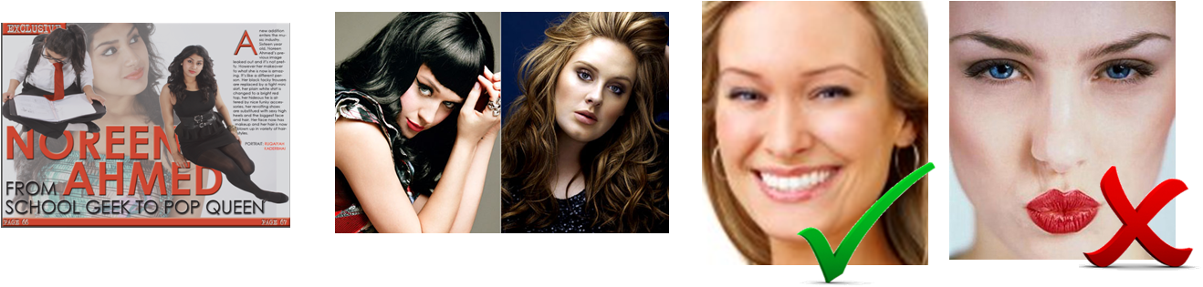
I have used photos that portray a pop style look of
being stylish and elegant like pop music artists such as Katy Perry and Adele
as my social group are similar but at the same time would tend to be unique and
not follow the popular trends as much. These types of pop artists are generally
looked up to and are idolised. Also the costumes my models have worn are
commonly seen on pop artists whom link in well with my chosen genre of pop. My
reasons for choosing my two models are that they represent the age group
firstly. They are both in their teens and they dress to the latest fashion
trends and their own fashion trying to get new fashion in their fans. Another effective
way my models represent social groups is the body language and facial
expressions. They are both always smiling and not pouting as that tends to give
an image of one showing off.
Additionally my models have portrayed themselves as
to be approachable due to the way they talk and the facial expressions in their
photos in the article suggest a more open person than the front cover picture.

The
types of shots I have used are varied throughout as it had to suit my article
as well. My main image had to be portrayed as a brave young girl so I used a
close-up shot. I used a close-up shot also because when doing my research and
analysing front covers I realised that most pop music magazine front covers are
close-ups of the artist with their hair blown out giving a carefree look which
promotes the genre and increases the relationship between readers and the pop
genre. I have used similar types of poses with those in pop music magazines so
I know it is suitable and fits my magazine theme.

Additionally, the effects such as emboss gave my
magazine a really professional look which made it more appealing and attractive
to readers as it didn’t look normal plain text. The emboss effect gave it a 3D
effect and this ended up being my magazine’s key effect throughout. Also
brightening up my images, especially the front cover main image made my
magazine look more engaging to the readers as my model is looking right into
the camera which makes it seem as if she is looking right at the reader. This also
increases the cheerful tone.

I expect readers of my magazine to be strong fans of
my chosen music genre and not just the artists and their gossip which is why I
have included a free A4 poster of a different artist each month. This
represents readers of my magazine as being loyal and devoted fans of the pop
genre.

-----------------------------------------------------------------------------------------------------------------------
This question explains that my magazine is representing a certain social group - i.e. fans of certain types of music and I have identified how my particular musicians are represented. To portray this I have discussed mise-en-scene so the costumes, body language, facial expressions, as well as the tone of the article. Also for pop artists I have have discussed how I have represented them as approachable, fun, innocent, etc.
No comments:
Post a Comment