Friday 21 December 2012
Production Log: Friday 21st December 2012
I finished my draft music magazine today. During the week I changed my masthead as I was told that my selected font looked more like rock and not pop.
Before Now


As the above images show my masthead before I made the change and after. I now feel more confident with my magazine. As I had only started creating my magazine a week ago with all my resources such as fonts and images I feel I have created a good draft under pressure of the deadline. I am aware of all improvements that are needed to be done as well as other features that need to be added like the page numbers on each page . Also the first page of the article page I am not happy with at all as there is too much white space.
Before Now

As the above images show my masthead before I made the change and after. I now feel more confident with my magazine. As I had only started creating my magazine a week ago with all my resources such as fonts and images I feel I have created a good draft under pressure of the deadline. I am aware of all improvements that are needed to be done as well as other features that need to be added like the page numbers on each page . Also the first page of the article page I am not happy with at all as there is too much white space.
Monday 17 December 2012
Production Log: Monday 17th December 2012
Over the weekend I found all the fonts I needed. I also finished my article page. However when I got feedback I was told that I needed more images and pull quotes as I had forgotten them. I also finished my poster page. I didnt have to make any changes in that. As I had to add another image on the article page, I was going through my photoshoot images to see what other suitable image I could use. I didn't want one of my model standing as I already had quite a few of those. So I found one of her sitting on the soundbox and it would look perfect in the corner. So I started editing the image on photoshop.
 |
| The fonts I found to use in my magazine |
Friday 14 December 2012
Production Log: Friday 14th December 2012
I continued with my magazine. I decided that I didn't like any of the fonts in the programme so I wasn't feeling that the magazine was going well. I found out some good websites which allowed downloading fonts. I started researching further into the fonts and what ones I will be using for the masthead, article, pull quotes, poster and contents page. As the article had to be in a clear, legible font I decided to have a font like the typewriter style. For the masthead I wanted a big thick font and that looks like its been biten into. I also researched what I should have on my poster other than the image itself.
 |
| The font I will be using |
Monday 10 December 2012
Production Log: Monday 10th December 2012
Today I continued designing my magazine on Adobe InDesign. I looked at the magazines previously created by other people and it gave me a better idea of what else I should include in my magazine, especially my contents page. As per my sketches I realised that I had to include much more content than just the features and reviews. I could to include a band index and I also had to include the editor's note on the contents page. I decided to import in my article and images so I can do the layout properly.
 |
| A band index |
Saturday 8 December 2012
Process: How to change colour
This is how I changed colour of my model's trouser from brown to red on Photoshop.
Tuesday 4 December 2012
Chosen Images
Chosen Images
This PowerPoint shows the images I have chosen for each page of my magazine. I feel they are the best ones and are suitable for my magazine.
Feedback
The images are bright and bold and catches my attention which makes me find out more about them. The costumes are also colourful so they suit the magazine theme.
Monday 3 December 2012
Production Log: Monday 3rd December 2012

Transcript
As I had a good idea for what I want my magazine to look like, I started it on Adobe InDesign. This is the programme/software I will be using to create my whole magazine. I started to layout my magazine and get to know the tools and how they work. I didn't exactly start my magazine as I hadn't even decided on my masthead and how it will look. The masthead ideas I did before were for a different name and I didn't like it. So for the rest of the time I was just exploring the programme and thinking of ideas for what my masthead can look like.
Friday 30 November 2012
Production Log: Friday 30th November 2012
I started planning out what I want my contents page and double spread page to look like. I found out that the magazine has to be nine pages long. So I planned out how that would work out. I finalised that one page will be for the front cover, two pages for the contents, four pages for the article - two pages will be an image or two and the other two pages will be the actual article - and the other two pages will cover the poster. I immediately thought for what images I want for the article and what image I will use for the poster. For the article, I concluded that I will have two images - one image per page - on one side I will have the geek image of my model, Noreen, and on the other page I will have the pretty one of her. For the poster I thought that my other model, Sophie didn't come up in the magazine as much so I chose an image of her for the poster. I started to layout the magazine on powerpoint and have a slight idea for what my magazine can look like. I used this layout as a starter for my sketches.
 |
| The layout of my front cover I created on PowerPoint |
Thursday 29 November 2012
Article Draft
Article for Magazine
Above is the draft of my article for the double page spread. It had to be at least 1000 words.
Feedback
I really liked the article as it kept me engaged. The interview seemed like as if I was talking to the artist. Additionally, the artist has given a lot of tips and advice about life in general so I can relate to it.
Image Ideas
Image Ideas
This task allowed me to research types of shots I should take during my photoshoot. I got a lot of ideas such as using the fan, taking lots of close ups but as well as other shots to have a variety to chose from.
Feedback
The poses are really effective as they will fill up the pages more. The poses and facial expressions will reveal the artist's attitude and the kind of person they are. There are a variety of poses which will allow you to choose from a lot.
Sketches
Front Cover

Contents Page

Sketching out my ideas on paper expanded my creativity as it allowed me to think about my layout and how cover the entire page. I am quite happy with my layout of the front cover however I have a feeling I will be changing the layout of the contents page as the font size will vary which make increase the white space on the page. I am also happy with the images I have chosen.
Feedback
I think the sketches are spectacular and include a large amount of detail. This is allows you to have a good idea for what your magazine can turn out like.
Wednesday 28 November 2012
Production Log: Monday 26th November 2012
I continued thinking of ideas. I learnt properly how to use Photoshop and how to get rid of the white background behind the images. This took me a while at getting used to though; the tools were quite confusing however as my models costumes were not the same colour as the background, it wasn't as time consuming. I decided that I should the get sketches of my ideas and the image ideas done by the end of this week. I had to do sketches of the front cover, the contents page and the double page spread. I have a good idea for what I want on my front cover and how everything should be placed. However I have no clue how I want my contents page and double page spread to look like. For the contents page I know what image I want to use and where I want it placed however the text I don't know where to place.
 |
| Removing the background on Photoshop |
Production Log: Friday 23rd November 2012
As I had done most of my others tasks I decided to start drafting out my magazine. I thought it was about time I start sketching out ideas for what my magazine will look like. I also looked closer into my images and picked some of my favourites that I might use for my magazine. I have to create a presentation about my image ideas so this was a headstart. I didn't do much though, I just thought mentally about ideas I could do for my magazine.
Production Log: Monday 19th November 2012
As I had done my photoshoot I was able to do my few other remaining tasks I couldn't do before, such as the props and costumes, location and equipment. These are just powerpoints stating what props and costumes my models used and wore in my photoshoot. The location is basically where my photoshoot took place. My photoshoot was in school so my images are not that many whereas if I had done it somewhere out like Central London then I would have had more to talk about but as this was my first photoshoot I didn't want to go out as I felt quite reluctant. The equipment task was easy as I just had to take images of the equipment I used in my photoshoot such as the camera, the white background sheet and the lighting umbrellas. I also had to create a contact sheet on Photoshop. A contact sheet is where all the images I took are placed neatly. I found this task quite hard. I was following the tutorial however I didn't realise it had to be done on Photoshop CS3 and not CS5. Photoshop CS5 didn't have the tool to create the contact sheet so I had to research online on how to do it.
 |
| The programme I used to create the contact sheet |
Friday 16 November 2012
Props, Costumes, Equipment and Location
Props, Costumes, Equipment and Location
This PowerPoint is showing all the props, costumes and equipment I have used for my photo-shoot. I have also presented where I have done my photo-shoot.
Feedback
The costumes are vibrant and attractive. They go well with the theme of the magazine and the model uses the costume well to demonstrate it's purpose. There is a variety of costumes showing the different personality of the model making it look appealing and interesting. It also looks very stylish and modern and would go well with the demographic audience. The use of a range of equipment shows a lot of thought gone into the process of creating the images for the magazine. I like the use of lighting style and angle of the camera as it makes the images attractive. The location of a white backdrop highlights the way in which models work and demonstrating this makes the magazine look realistic.
Monday 12 November 2012
Concept Ideas
Front Cover
Main Selling Cover Line
'Geek to Chic'
Supporting Cover Lines
- Taylor Swift armed with EMAs
- Win X Factor Live Tour tickets!
- Noreen Ahmed - most popular geek
- Stars singing at Jingle Bell Ball 2012
- Eminem leaves a permanent effect
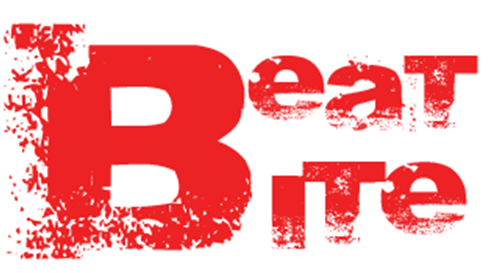
Magazine Name:
Beat Bite
Magazine Slogan:
Bite into the Best
Plugs:
'Pull Out Free Poster Inside!'
Price:
£3.50
Contents
Sections:
- Features
- Regions
- Charts
- Reviews/Upcoming Shows
Features:
- Interview with Noreen Ahmed
- Splitsville at Sel-ieber
- The Saturdays Filming in LA
- 1D star, Zayn, changed for the worse?
- Taylor Swift turns on Christmas lights at Westfield
- Bieber Backstage at Victoria's Fashion Show
Regions:
- Win tickets for X Factor Live Tour 2013
- Win tickets to Jingle Bell Ball 2012
- The Editor's Voice
- Our Thoughts On Yours
Charts:
- Top 40 songs of the previous month
Reviews:
- MTV European Music Awards 2012
- 100th Royal Variety Performance
- Taylor Swift's album 'Red'
Upcoming:
- Rita Ora Concert
- One Direction Tour 2013
Subscription
- Save a lot of money
- Get full interviews
- Get first chance at winning tickets
The Editor's Note
This month's issue of Beat Bite is one not to miss. Firstly an interview with new member Noreen Ahmed pours on pages __,__. Also know how Selena and Justin felt with their break up. Taylor Swift leaves the EMAs with head held high and plenty more. This month you now have a chance to win tickets to two huge shows! This rarely ever happens. Additionally, see if what you're listening to has hit the charts or not...
Ruqaiyah Kaderbhai, Editor.
Contacts
Twitter: Follow Us - @BeatBite
Facebook: Like Us - Beat Bite
Email: Email Us - mythoughts@beatbite.co.uk
Website: Visit Us - www.beatbite.co.uk
Radio: Listen to Us - 78.6 FM
Main Selling Cover Line
'Geek to Chic'
Supporting Cover Lines
- Taylor Swift armed with EMAs
- Win X Factor Live Tour tickets!
- Noreen Ahmed - most popular geek
- Stars singing at Jingle Bell Ball 2012
- Eminem leaves a permanent effect
Magazine Name:
Beat Bite
Magazine Slogan:
Bite into the Best
Plugs:
'Pull Out Free Poster Inside!'
Price:
£3.50
Contents
Sections:
- Features
- Regions
- Charts
- Reviews/Upcoming Shows
Features:
- Interview with Noreen Ahmed
- Splitsville at Sel-ieber
- The Saturdays Filming in LA
- 1D star, Zayn, changed for the worse?
- Taylor Swift turns on Christmas lights at Westfield
- Bieber Backstage at Victoria's Fashion Show
Regions:
- Win tickets for X Factor Live Tour 2013
- Win tickets to Jingle Bell Ball 2012
- The Editor's Voice
- Our Thoughts On Yours
Charts:
- Top 40 songs of the previous month
Reviews:
- MTV European Music Awards 2012
- 100th Royal Variety Performance
- Taylor Swift's album 'Red'
Upcoming:
- Rita Ora Concert
- One Direction Tour 2013
Subscription
- Save a lot of money
- Get full interviews
- Get first chance at winning tickets
The Editor's Note
This month's issue of Beat Bite is one not to miss. Firstly an interview with new member Noreen Ahmed pours on pages __,__. Also know how Selena and Justin felt with their break up. Taylor Swift leaves the EMAs with head held high and plenty more. This month you now have a chance to win tickets to two huge shows! This rarely ever happens. Additionally, see if what you're listening to has hit the charts or not...
Ruqaiyah Kaderbhai, Editor.
Contacts
Twitter: Follow Us - @BeatBite
Facebook: Like Us - Beat Bite
Email: Email Us - mythoughts@beatbite.co.uk
Website: Visit Us - www.beatbite.co.uk
Radio: Listen to Us - 78.6 FM
Production Log: Friday 9th November 2012
Today I continued with drafting my magazine and what will be going on it. I started thinking about my article and what it will be about. I decided to do an article on a new member entering the music industry and how she was ugly at first and became really pretty. This has also allowed me to think further about my photo-shoot and what my models should dress up as. Also I thought of a really good image idea for the front cover which would attract my audience. My main image idea is basically of one of my model with the whole ugly geek look and a really pretty hot look and I will be cutting it half and half and putting each of the images together. So half of it will be ugly and the other half will be pretty.

And my main selling cover-line to go with it will be 'geek to chic'. I also thought of another name for my magazine and I personally think its quite clever especially with its slogan. My magazine name will be 'Beat Bite' and the slogan with it will be 'Bite into the Best'. For the name, the two words will share one B so the whole name is more of a square shape and it will be placed on the top left hand corner of every magazine issued.


And my main selling cover-line to go with it will be 'geek to chic'. I also thought of another name for my magazine and I personally think its quite clever especially with its slogan. My magazine name will be 'Beat Bite' and the slogan with it will be 'Bite into the Best'. For the name, the two words will share one B so the whole name is more of a square shape and it will be placed on the top left hand corner of every magazine issued.

Friday 9 November 2012
Production Log: Monday 5th November 2012
Today I decided that I should move on to the drafting of the actual magazine on InDesign and start thinking of cover-lines and the images I will be using for the magazine from my photo-shoot. Even though I have quite a few tasks to do for the planning but I can only do them once I have done my photo-shoot and I think I will be able to a lot more things and think for a lot more ideas once I can view my photos. I started thinking about my layout and how I will be placing my images and text. Also I decided to change my name from Platinum to something more creative as Platinum is quite boring sounding and doesn't really please me. I feel like I can do better.
 |
| The logo of the programme I started to do my magazine |
Monday 5 November 2012
Promotional Methods
There are many ways to promote a new magazine, especially with the technology today such as social media like Facebook and Twitter.

It is important to promote your magazine so the people know about it and you can predict if it will be worth it and a success. I could start a new page on Facebook or create an account on Twitter. This can engage with the public from around the world. Another way to engage with the public and promoting the magazine is doing it in person. For example you could stand outside a popular shopping centre or a place such as Central London and give out free copies of the magazine.

Maybe also you could ask for peoples opinion on the magazine and if any improvements or changes should be made.
New Media
We are surrounded by media. Everywhere we go media is somehow there. For example on newspapers, radio etc. The new media today is shown through Internet; Facebook, Twitter and Smart Phones. So getting a magazine known to the public is quite easy with the Internet.
On Facebook, magazine companies can post sneak peaks of an issue of a magazine.
On Twitter, magazine companies can tweet competitions and what may be included in the next issue of the magazine but not revealing too much as it may lose consumers' interest.
Most people also have smart phones (iPhones, Blackberrys, Androids) so they get news and information on their tip of their hands. Some magazines also have iPhone apps showing some features of their magazine on the app.
Saturday 3 November 2012
Colour Ideas
Colour Ideas
This shows the colours I will be using throughout my magazine. I will make sure that my models wear these colours so they fit with my colour scheme. If they don't have these particular colour clothes I will just have to photoshop it.
This shows the colours I will be using throughout my magazine. I will make sure that my models wear these colours so they fit with my colour scheme. If they don't have these particular colour clothes I will just have to photoshop it.
Name Ideas

Time-lapse
Thursday 1 November 2012
Production Log: October Half Term
Over the half term I did a number of tasks. I did promotional methods, colour, new media, survey results and name ideas. I also had to do the props and costumes task however I hadn't done my photo-shoot so I couldn't do that task. However I did start planning what I want my models to wear and my aims behind it. The promotional methods task was to explain ways to promote a new magazine. Colour was to show what colours I have chosen for my magazine and why I have chosen them. I have chosen red, black and white. New media is quite linked to promotional methods. New media just indicates all the new media around us; Facebook, Twitter etc. The survey results was meant to be the easiest task of all however the site I did my survey on, www.surveymonkey.com, was a bit weird and said I had to upgrade to the Premium Membership to allow me to copy the graphs they create for me. So this meant that I had to create my own graphs/pie charts to show my final results. However the good side was that I got 50 responses so my results were more stronger and collective. The last task, names idea, was the hardest of all. I had to think of an name that I could use for my magazine and put it in different styles and fonts. I found this hard because I couldn't think of a suitable name but after a lot thinking I came up with the name 'Platinum'. I highly doubt I will use this name as I'm not feeling it yet. But I will see closer to the time.
Additionally I also created my time-lapse which is basically a video or pictures of me doing my photo shoot; behind the scenes. The pictures involve my models doing their and make-up and pictures of me taking pictures. I did this with another camera set-up behind me which would take a picture every 10 seconds. I put all the images in Adobe Premiere creating a short video.
Additionally I also created my time-lapse which is basically a video or pictures of me doing my photo shoot; behind the scenes. The pictures involve my models doing their and make-up and pictures of me taking pictures. I did this with another camera set-up behind me which would take a picture every 10 seconds. I put all the images in Adobe Premiere creating a short video.
 |
| The website I used for my survey |
 |
| Types of promotional methods |
Friday 26 October 2012
Thursday 25 October 2012
Survey
I have created a survey to help me on what I should include in my own magazine. Please click the link below to fill in my survey:
Monday 22 October 2012
Target Audience
Target Audience
This presentation shows the audience I am targetting. I have mentioned the age group, gender division, social class, the interests and social habits they would have, the consumption habits and how and why they would consume my magazine.
FeedbackIt is clear and easy to understand who the target audience is. It is a suitable age group and a wide variety of people are able to read the magazine. The social class is also suitable for the magazine and fits in well with the proposal.
Proposal
Proposal
Above is a proposal which includes a detailed view of my magazine which states what I want my magazine to look like and what each page includes. I have included information on the type of magazine, the frequency, possible stories, the mood, unique features, marketing methods, key images and the main feature.
Feedback
I see a good magazine coming along with all the right features of a successful magazine despite of not having created anything physically. The ideas are really innovative and not too complicated. The marketing methods are good and will allow potential readers to engage with the magazine.
Friday 19 October 2012

Model Release Form
Below is my model release form. This is a confirmation that my two models allow me to use their images in my music magazine.


Production Log: Monday 15th October 2012
Today I didn't do anything new. I just improved all my production logs and made them as detailed as possible. I couldn't really do much new as my photoshoot is on Wednesday and most of the tasks are to do with the photoshoot. I however did some research of different types of shot that would look nice on the front cover. The image in my head for the front cover's main image was a close up of the model with a fan blowing their hair. I think it would be really effective.
 |
| The idea for my front cover |
Sunday 14 October 2012
Existing Names and Mastheads
Above is an analysis of different names and mastheads of existing magazines and how they are successful in their way. This got me thinking about my name of my magazine and the appearance of it.
Friday 12 October 2012
Creative Post
I was set a homework where I had to create a post which is to do with my course but it is not on the list for the tasks that need to be done. So, for example some ideas I had come up with was to create my own 'pretend' app. However I didn't feel it was that creative so instead I designed my own website for my magazine. See below a print screen of my website.


Institution of Music Magazines
Institution of Music Magazines on Prezi
This task allowed me to research into the publishing side of music magazines. I answered the following questions:
- What is an institution?
- The main publishers of music magazines
- How do magazines get published?
This allowed me to think about who would be interested in distrubuting my magazine.
This task allowed me to research into the publishing side of music magazines. I answered the following questions:
- What is an institution?
- The main publishers of music magazines
- How do magazines get published?
This allowed me to think about who would be interested in distrubuting my magazine.
Representation of Pop Music
Representation of Music Magazines on Prezi
This task allowed me to look more into my chosen genre of music which is pop music. I researched all the key things of pop music and pop music magazines. I answered the following questions:
- How pop music is represented?
- What is pop music?
- When did pop music start?
- The structure of pop music
- Pop music today
- Pop music artists
I also listed other types of genres.
Production Log: Friday 12th October 2012
I felt my production logs were becoming less detailed each time so I thought I'd go back on each one and added more detail on them. I spent about 15 minutes on that. I also hadn't made an explanation for each of my analysis on the front covers, contents pages and double page spreads. So I also went back and added a small paragraph, briefly explaining what each Prezi is showing. As the 15 minutes ended I decided to the improvements some other time as too much time was taking and I needed to be on track with the current tasks. I carried on doing the key concepts of music magazines and I managed to finish the representation of music magazines and pop music. I made sure I finished institution of music magazines over the weekend as I didn't want to fall behind. Additionally I set myself extra work that I should do the existing names an mastheads task as well as it didn't seem long.
Wednesday 10 October 2012
Production Log: Monday 8th October 2012
As to what I said previously, I started the key concepts task; codes and conventions, audience, representation and institution. I had done the codes and convention presentation over the weekend so thats one out of four done. Today I started doing further research on audience of music magazines like who reads them and why they read them. I found some key information and saved it. Some of the research I found was a few pie charts with helpful information to support other information such as: which music magazine is read the most, what price is people willing to pay for a music magazine, which feature do most readers look forward to when they pick up a magazine and the number of magazines bought per month by one person. The researching took up a lot of my time so I didn't get round in actually starting the presentation itself. Also I decided to make my blog page more appealing so I added a background and changed the home colour from blue to purple. I also re-did my labels as they were wrong.
 |
| My Blog Page before |
 |
| My Blog Page after |
Masthead and Colour Ideas

Something like above. But I will think further and gather more ideas.
Audience of Music Magazines
This Prezi indicates the audience of a music magazine answering the following questions:
- Who is music magazines aimed at?
- Who reads music magazines?
- Why are magazines successful?
- Which gender and age group read magazines?
- Why would anyone read a music magazine?
I also included some data and numbers about music magazines and its audience.
This task allowed me to think about my target audience.
Codes and Convention of a Music Magazine
Codes and Conventions of a Music Magazine on Prezi
This Prezi illustrates all the codes and conventions of a music magazine. Codes and conventions is all the details that create a successful magazine. I have included an example of each code and convention. During this task I learnt a lot of new things about magazines which allowed me to think further about mine.
This Prezi illustrates all the codes and conventions of a music magazine. Codes and conventions is all the details that create a successful magazine. I have included an example of each code and convention. During this task I learnt a lot of new things about magazines which allowed me to think further about mine.
Friday 5 October 2012
Production Log: Friday 5th October 2012
Today, I started to gather ideas for my next task, key concepts of music magazines by brainstorming each topic in it. There are four topics: codes and conventions, audience, institution and representation. For each topic I did a bit of research for me to get a better understanding for what each of them are about. During my research I found out that codes and conventions is basically what ingredients/elements in needed to create a successful magazine. The audience is about who reads magazines and why. The representation topic explains how music magazines and its genre of music are represented; colours, fonts, layout, images etc. Finally the institution is about who/which big companies produce and publish each magazines. One of the publishers I found is 'Bauer'. For each of these topics I had to create a presentation to show my findings. For this I chose Prezi as my presenting programme.
 |
| One of the publishers |
Tuesday 2 October 2012
Mood-board
This is my mood-board which contains a collection of images such as artists, album covers, magazines, etc from Pop Music as that is the genre I want my music magazine to be based on. I have also included a pop music soundtrack which allows readers know what genre of music I am trying to aim to. (please put sound on)
Friday 28 September 2012
Magazine Double Spread Page Analysis
I researched three double page spreads from music magazines before I started to create my own to get some inspiration on what to do for mine. I looked at all the key details that make a magazine a successful and how it targets its audience. It also allowed me think about what my article should be about and how long it should be.
Production Log: Friday 28th September 2012
Today I went through my blog and made sure everything was completed to its best. I had forgotten to add labels to a few of my posts so I added them in. I checked out the next task which was key concepts but I didn't want to start that yet. So instead I started to do research for my mood-board. I decided to base my music magazine on pop music so I researched images on pop music. I also looked at other mood-boards to see what is actually included. I found out that I should include pop music artists, their album covers and some pop music magazine covers. I had to present this in a very effective way so I decided I wouldn't do Prezi as I had used that in my analysis' for the front covers, contents pages and double page spreads. I wanted to play a famous pop music soundtrack in the background so the best programme for that would be Windows Movie Maker. So I decided I'll play the song by Labrinth, a famous pop artist, and he's song 'Earthquake'. The song is quite upbeat so it would sound effective. Also the song is 3 minutes and 57 seconds long so I needed to find loads of images!
 |
| The song Earthquake by Labrinth |
 |
| The programme I will be using to create my mood-board |
Thursday 27 September 2012
Magazine Contents Page Analysis
I researched three contents pages from music magazines before I started to create my own to get some inspiration on what to do for mine. I looked at all the key details that make a magazine a successful and how it targets its audience.
Monday 24 September 2012
Production Log: Monday 24th September 2012
Today I started to do research for images of contents pages and double page spreads to use them for my analysations. I had to find three of each type. My aim was to find three very different contents pages; not only because I want the analysations for each to be different but also for me to get further ideas for my own magazine's contents page. Also I don't want to be repeating my analysis' as I won't be learning anything new. I felt I spent a bit too long researching for the contents pages as I kept finding something I like from it. For example:

I just really like the way the main image takes up so much space and how the mushroom the model is holding is so much bigger than her but it brings attention to the readers as it isn't something you would see generally. It is also quite random. And also how the contents is so tiny and it only takes up a small part of the whole page. The layout looks really attractive but yet so simple.
Monday 17 September 2012
Production Log: Monday 17th September 2012
Today I made a list of all the tasks I had to complete/completed before I start my final music magazine. I was able to tick of the preliminary task. However I hadn't created a video for it which shows how I created the front cover and contents pages. I had to use a programme called 'CamRecorder' which would basically show what's on the screen. As I had already created my front cover and contents page the only way I could show how I made it was by clicking an eye icon on each layer on Photoshop. If the eye is shown that means the objects on the layer is also shown and vice versa. I then had to edit it on Adobe Premiere but cutting the beginning part and the end part. The task was only a matter of 5 minutes however to export it, it took extremely long so I didn't get to do anything else.
The programme I used to video of how I created the preliminary task.

The programme I used to edit the video.


The programme I used to video of how I created the preliminary task.

The programme I used to edit the video.

Video of Preliminary Task
Above is a video of how my magazine front cover and contents page builds up step by step.
Sunday 16 September 2012
Ideas For My Music Magazine
While I was researching the music magazines I started planning few things like the masthead and type of shots I would like to use. I would obviously like mine to look different from the other music magazines. Like for example, most the mastheads are on the top, I was thinking of doing mine going down on the left hand side. But that obviously depends on what my masthead is.


And I have also asked a few of my friends if they would like to model in my photo shoot and they have accepted my request! So I see a really good magazine in my mind. Hopefully it will look better in reality!
Analysis of Music Magazine Front Covers
Magazine Cover Analysis on Prezi
Above is a Prezi on music magazine front covers analysis'. This is part of my research. I had to analyse three front covers. I wanted each of them to look different from one another so my analysis is detailed in different ways.
Above is a Prezi on music magazine front covers analysis'. This is part of my research. I had to analyse three front covers. I wanted each of them to look different from one another so my analysis is detailed in different ways.
Friday 14 September 2012
Production Log: Friday 14th September 2012
Today I started the research part of the project. The first tasks of the research was to analyse three front covers, three contents pages and three double spread pages of music magazines. I don't really read music magazines in detail; I just find out all the gossip online so I didn't know many music magazines apart from Billboard. So I had a lot more research to do. I had to know all the different famous music magazines and then research their front covers, contents pages and double spread pages. I also had to research how to analyse music magazine covers, contents pages and double page spreads. I didn't know the key terms of the main elements of magazines; for example: masthead, main image, cover lines etc. I looked at previous analysis of front covers and they were quite detailed so I knew this won't be an easy task. I aimed to try and finish the analysis of front covers on Prezi, a presentation software. Prezi was extremely hard to use and I kept getting fed up quite easily. As I was new to Prezi I wasn't able to finish the analysis in time so I had to do it in my independent study time.
 |
| The Prezi Logo |
 |
| The Prezi Menu |
 |
| The Prezi Selector |
Thursday 13 September 2012
Preliminary Task - Magazine
My magazine front cover:

My magazine contents page:

Above is my preliminary task. We had to create a front cover and contents for a magazine for Haydon School. We had to finish this in 2 lessons. I found that quite hard as I didn't know how to use Photoshop so it took me more than two lessons.
I didn't want to have too much on it. I wanted to keep it plain and simple with only a few cover lines. I decided to follow the Haydon Stag colour scheme of a dark yellow and dark blue. I kept the background a picture of the field with a member of my class with recycling bin trying to exhibit that Haydon won the recycling award. I also included the date and price. If I was to improve my front cover I would definitely change the name of the magazine, the masthead. I would also add a selling line above it. I would maybe add a few more images.
For the contents page I didn't know what to put exactly. Our teacher just said to make up a few story lines and add a few images. So that's what I did. If I was to improve it I would a lot more detail because after I did research I realised what a contents page actually included. So I would a few more appropriate details.
Production Log: Thursday 13th September 2012
I finished my preliminary task today in my independent study time as I needed to start the new task. I didn't have much to do except make sure everything was okay and not bad. I do however feel I could do so much better if I had more time but as it is a preliminary task I didn't want to spend so much time on it. I uploaded it to Blogger and a small evaluation of it underneath.
Monday 10 September 2012
Production Log: Monday 10th September 2012
Today I continued with the preliminary task. On the front cover I added my main image. I tried fiddling around with the tools if I could get rid of the background of the field however some people around me said that it doesn't look bad with the field in the background and trying to get rid of it will be hard as I am still learning the other basic tools on Photoshop. So listening to their feedback I kept the background and used it for my contents page as well. It did turn out to be quite effective. On the front cover I also changed about some colours I had used at first and added a back box behind the date and price to make it stand out. I based my colour scheme on the colours of the stag; blue and yellow. On the contents page I added in a few story lines and added page numbers. I tried to make it look as realistic as possible by inserting pictures around the actual contents but due to lack of Photoshop skills and my aim to finish as soon as possible I couldn't do my best. If I was to do this task again I would definitely do some research of how magazines front covers and contents pages look as I don't really pay attention to that when I am actually reading magazine. Also I would choose a better name of the magazine. 'Haydon Updates' was too boring sounding and a catchy magazine name was needed.
Subscribe to:
Posts (Atom)